AseHantaAseHanta
Back to AseHanta
Brand & Origin

AsehantaOur story in a symbol.

An idea born through collaboration, carried forward through commitment. This is the origin and meaning behind the AseHanta logo — from a simple house symbol to a Y-shaped emblem that remembers three founders and the one who continued.

Designed by the founder Three founding initials
The AseHanta logo
AseHantaOfficial mark

Three branches

The three extensions of the Y-shaped emblem deliberately symbolise the three individuals who came together to establish the original business idea.

Shared beginnings

The emblem represents the collaboration upon which AseHanta was initially built, and the common origin the founders still share.

One continued journey

The golden-yellow stroke runs downwards towards the letters ASE, pointing specifically at the S for Samuel — the founder who carried the idea forward.

The origin & meaning

A logo built from memory, not decoration.

Every part of the mark holds a name, a relationship and a decision. The navy blue gives AseHanta its visual home. The gold carries the personal story of the founder who stayed.

AseHanta in one line

“An idea born through collaboration, carried forward through commitment.”

01

The Story Behind the Symbol

The AseHanta logo is more than a visual identity. It represents the origins of an idea, the collaboration of three individuals, and the journey of one founder who continued to carry that idea forward.

The logo was conceptualised and designed by Aginah Samuel Namale, Founder of AseHanta.

Its design draws inspiration from the company's original founding story, preserving the identities of the three individuals who first came together to develop the business idea: Allan Ruto, Samuel Aginah Namale, and Emmanuel Kipchirchir.
02

The Original Logo and Its Evolution

The original AseHanta logo featured a house symbol, representing the company’s initial focus on housing and real estate.

As the idea and its identity evolved, so did the logo. The original house symbol eventually gave way to the distinctive Y-shaped emblem used in the present design.

This evolution introduced a deeper personal meaning, connecting the visual identity to the three individuals behind the original idea and the founder who continued developing it.

03

The Meaning of ASE

The three letters, A, S and E, positioned beneath the emblem, represent the initials of the three original individuals.

AAllan Ruto
SSamuel Aginah Namale
EEmmanuel Kipchirchir

These initials commemorate the three individuals who participated in the conception and early development of the AseHanta idea. Although Allan Ruto and Emmanuel Kipchirchir eventually stepped away from the venture for their own valid reasons, their place in its beginnings remains represented in the logo.

04

The Meaning of the Y-Shaped Symbol

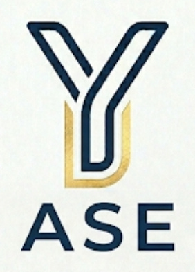
The distinctive Y-shaped emblem represents the three branches of the original founding team. Its three extensions were deliberately designed to symbolise the three individuals who came together to establish the original business idea. The emblem therefore represents the shared beginnings of AseHanta and the collaboration upon which the idea was initially built.

05

The Significance of the Golden-Yellow Stroke

The golden-yellow stroke represents Aginah Samuel Namale, the founder who continued with AseHanta after the other two original participants stepped away. Its position is deliberate. The golden stroke runs downwards towards the letters ASE, pointing specifically towards the letter S, representing Samuel. This visual arrangement communicates continuity: although the original idea began with three individuals, one founder remained committed to carrying it forward. The golden-yellow stroke therefore represents the founder’s personal connection to the venture and his continued role in its development.

06

The Colours and Visual Identity

The logo primarily incorporates navy blue and golden yellow. The navy blue was selected purely for aesthetic reasons, contributing to the visual appearance and overall design of the emblem. It was not originally assigned a specific symbolic meaning. The golden-yellow stroke, on the other hand, carries a deliberate personal meaning, representing the founder who continued with the venture. Together, the colours form the distinctive visual identity of the AseHanta logo.

07

A Symbol of Origins and Continuity

The AseHanta logo brings together two important aspects of the company’s beginnings: its origins — the three initials and the Y-shaped emblem preserve the story of the three individuals who initially conceived the idea; and its continuity — the golden-yellow stroke identifies Samuel, the founder who continued developing the venture. Designed by its founder, the logo evolved from a simple house symbol representing housing and real estate into an emblem that also preserves the story of its founding team. It remains a visual reminder that AseHanta’s beginnings involved collaboration, while its continued journey reflects commitment and perseverance.

The mark, explained

Three branches. One golden line.

The Y-shape holds the three founding branches together. The gold stroke then travels down toward the letters ASE, landing on the S. That small detail is the heart of the mark: collaboration at the start, continuity from the founder who carried it forward.

Blue branches

The three extensions of the founding team.

Golden stroke

Samuel — the founder who continued the journey.

ASE initials

Allan, Samuel and Emmanuel, remembered beneath the mark.

The original AseHanta Y-shaped emblem with the ASE initials
Three branchesOne gold lineASE initials

Brand palette

Blue and gold, always.

Deep navy and blue shades carry the brand. Gold is reserved for the name, the founder’s stroke and moments that deserve emphasis.

#071426

Deep Navy

#1D4ED8

AseHanta Blue

#60A5FA

Sky Blue

#D4AF37

AseHanta Gold

#DBEAFE

Soft Blue

An idea born through collaboration.Carried forward through commitment.

AseHanta keeps its beginnings visible. If you would like to know more about the brand, the story or the people behind it, we are always happy to talk.

+254 748 275 079 · Eldoret, Kenya